Balance Breens
Reimagining healthier communities by connecting people with premium supplements
Role Designer Type Project Skills UX Design, Packaging Design
Balance Breens empowers individuals both physically and mentally by providing them with premium dietary supplements, enabling them to lead healthier, more balanced lives.

RESEARCH
Heuristic Analysis
Prior to website redesign, we assessed what’s working and what’s not from an interaction and usability standpoint through heuristics review.
Main Issues:
Inconsistent shapes, shadows, and colors
Excessive visual distractions and clutter
Poor contrast affecting readability
Inconsistent font styles and sizes
Hidden call-to-action buttons
Competitive Analysis
We conducted research on the designs of currently leading competitor brands to identify patterns, ideas, and inspiration for the redesign of Balance Breens.
Findings:
Minimalistic and clutter-free layout boosts engagement
User testimonials and emotional appeal build trust
Clear, concise typography and text encourage action
Well-organized product categories allow for easy exploration
Prominent search bar, favorites, and cart optimize discovery and purchase
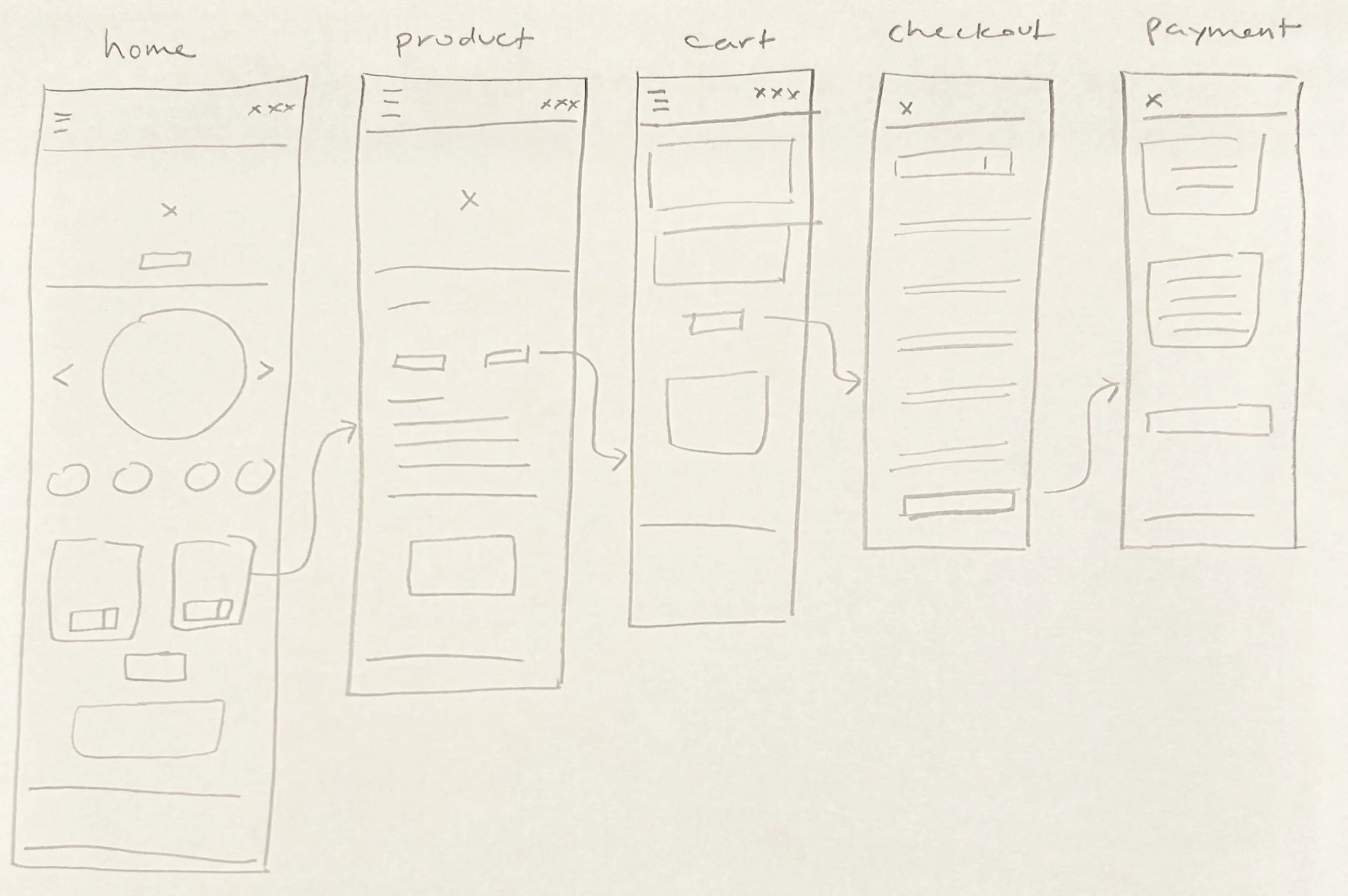
SKETCHES
DESIGN
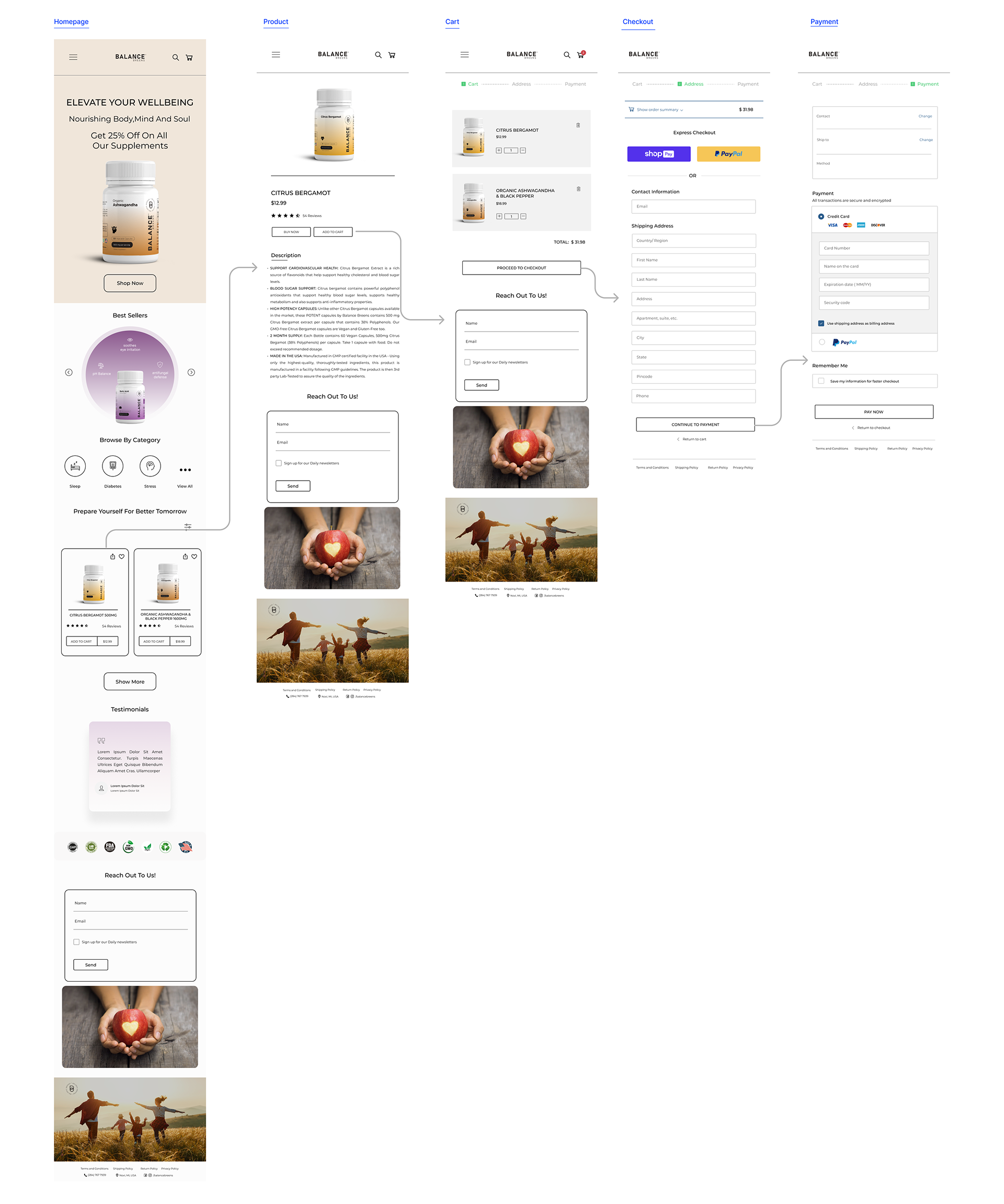
PROTOTYPE
Before
This is Balance Breen’s website before our redesign.
This is the desktop view after our redesign.
After
This is the mobile view after our redesign.
PROCESS
Our journey with the client was a continuous work in progress. We iteratively designed, conducted Zoom meetings to align with their needs, and refined our approach through ongoing research. The result? A final design that left our client delighted.
IN RETROSPECT
01
Designing for E-commerce is Complex
Designing for e-commerce involves multiple layers ranging from organizing content for effortless navigation to optimizing microinteractions for smooth transactions. It's crucial not just to attract users for purchases, but also to guarantee a seamless experience, allowing for customer retention.
02
Branding Elevates Businesses
Effective branding not only establishes a unique identity but also fosters trust and differentiation, ultimately allowing a business to not only thrive but to stand out as a leader in its industry. It plays a pivotal role in creating lasting connections with customers, cultivating loyalty, and positioning the business as a trusted and memorable choice among its competitors.
THE INTRODUCTION
Balance Breens is a nutraceutical company known for its commitment to promoting holistic well-being. With over two decades of industry expertise, the company specializes in developing and manufacturing a wide range of dietary supplements, vitamins, and herbal products that cater to various aspects of physical and mental health. They prioritize transparency, quality assurance, and sustainability, ensuring consumers have access to safe and effective supplements.
Balance Breens has been facing the problem of more customers purchasing their supplements through Amazon instead of through their website, leading to reduced revenue. They would like to improve their website to encourage more direct purchases. They also want a compelling brand identity, including logo and packaging redesign, in alignment with their core concept of balance.
Essentially, Balance Breens wants us to
redesign their website and enhance logo and packaging designs to strengthen brand identity and drive direct purchases.
BACKGROUND

PROJECT OVERVIEW
Improved branding with redesigned logo and packaging aesthetics
Rethought architecture and improved usability on mobile and desktop
Transformed content and presentation with strategic UX writing
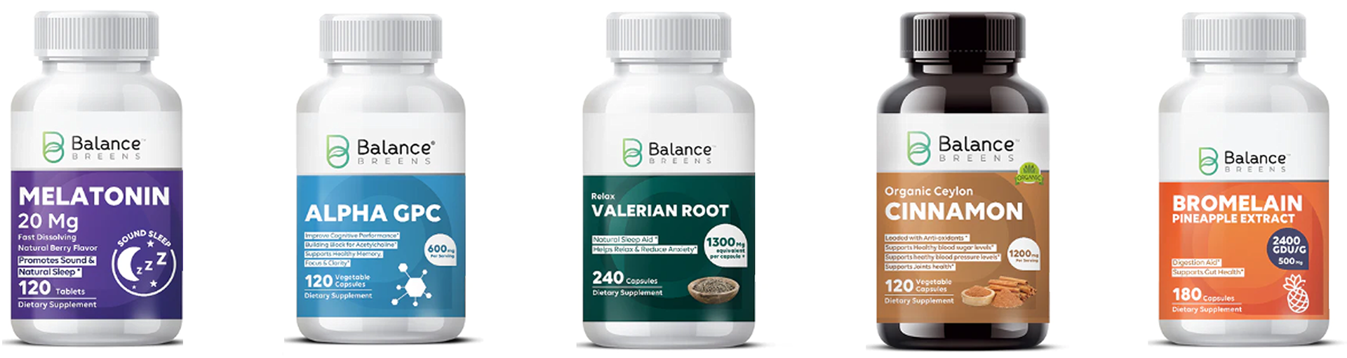
PACKAGING DESIGN
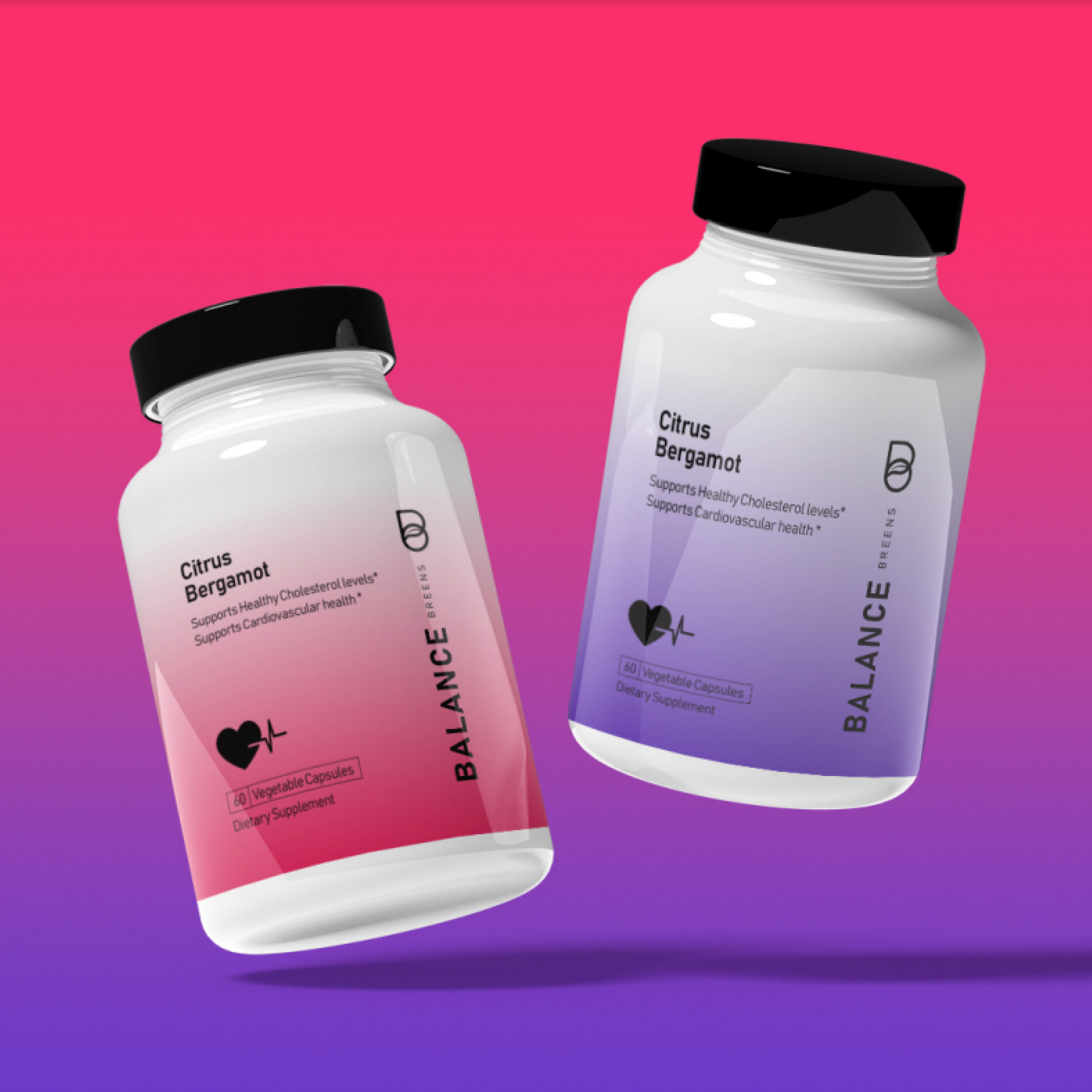
The redesign of bottle packaging focused on simplicity, consistency, and aesthetic appeal. The result is a clean, cohesive design that enhances product appeal and brand identity.
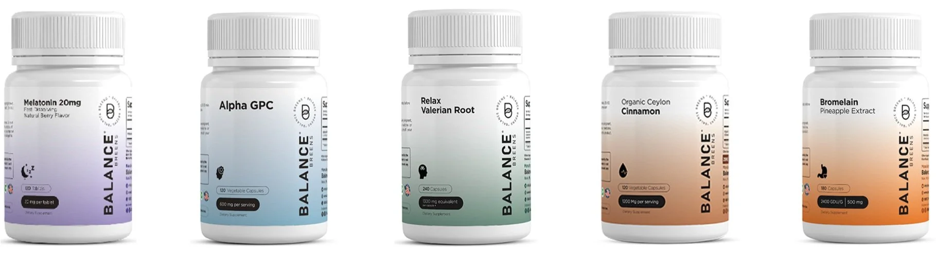
Before
After
-
Sneha Yedulla, Madhulika Avancha, Chaitanya Dumbhare
-
July 2023 - September 2023
-
Figma, Adobe Photoshop