
Michigan Rec Sports
Revitalizing campus wellness with an enhanced fitness community app
Role Designer Type Project Skills UX Research, UX Design
Rec Sports fosters a culture of health and fitness through engaging activities, leadership opportunities, and accessible facilities, empowering U-M students to play, stay fit, and thrive on campus.

RESEARCH
Goals & Questions
UM Rec Sports wants to upgrade its mobile app to enhance user experience and increase engagement within the student community. To achieve this goal, our team crafted a set of research questions designed to uncover key insights informing the app redesign process. These questions were devised to gain deeper insights into user behaviors, preferences, and challenges:
What are the key demographics of the current app users?
What do the target audience value in an app for Rec Sports?
Why do users currently engage with the app?
What are the challenges or frustrations that users face within the app?
How consistent is the user experience between the app and the website?
How intuitive do users find the current app interface for accomplishing tasks?
What additional features would current users like to see in future updates of the app?
What are the potential opportunities for expanding or enhancing the app's features based on user feedback?
Results
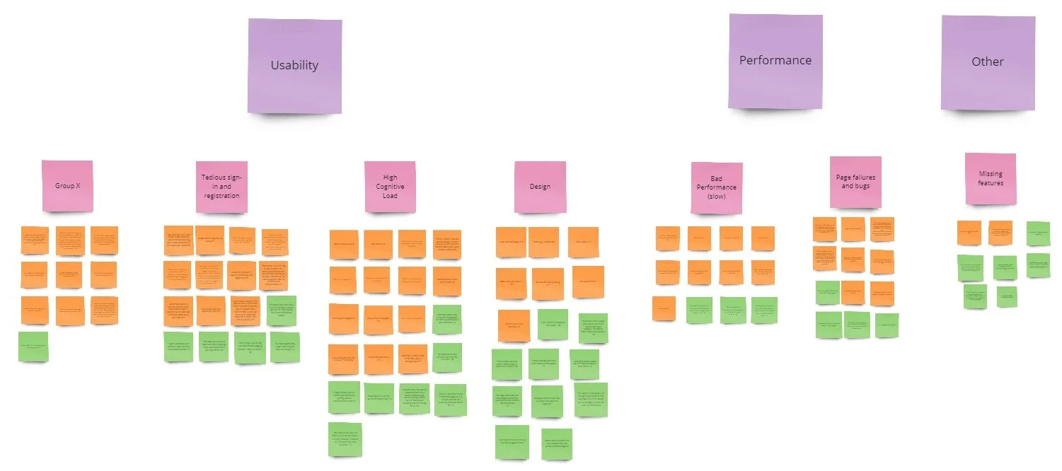
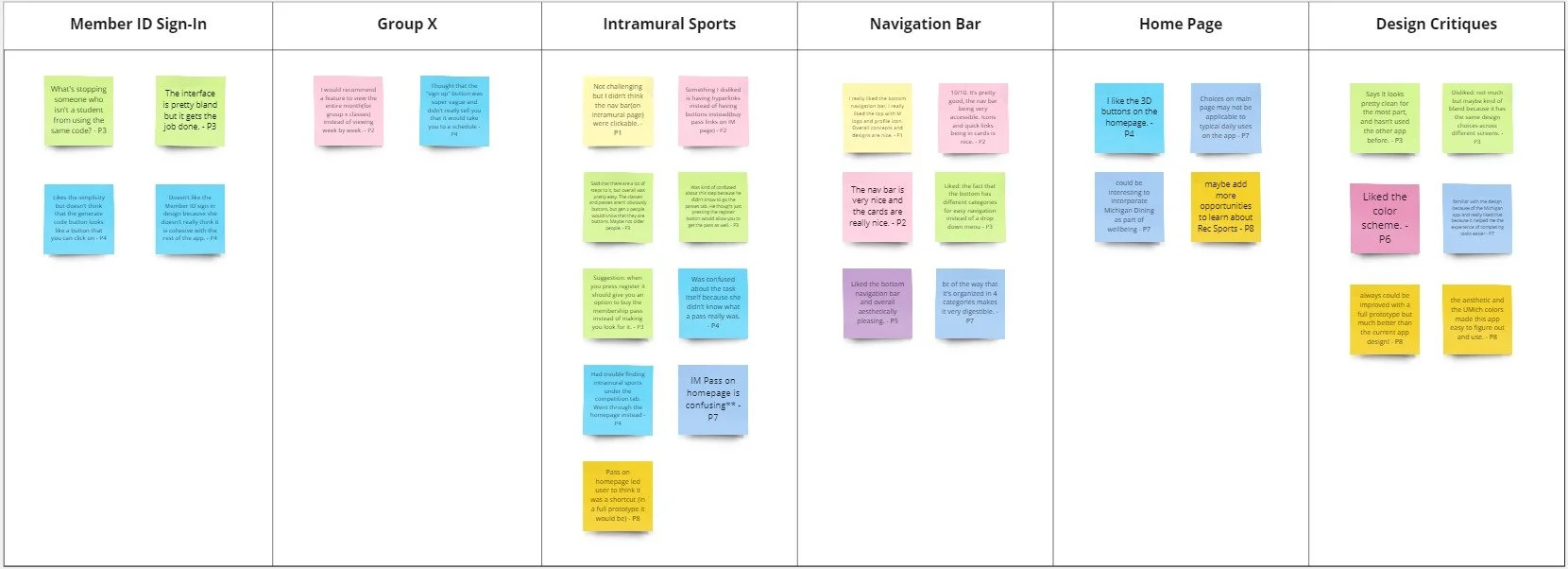
We gathered data on our research questions through conducting usability tests and surveys with 80+ students. We then analyzed the data.
5 User Interviews

Affinity Diagram
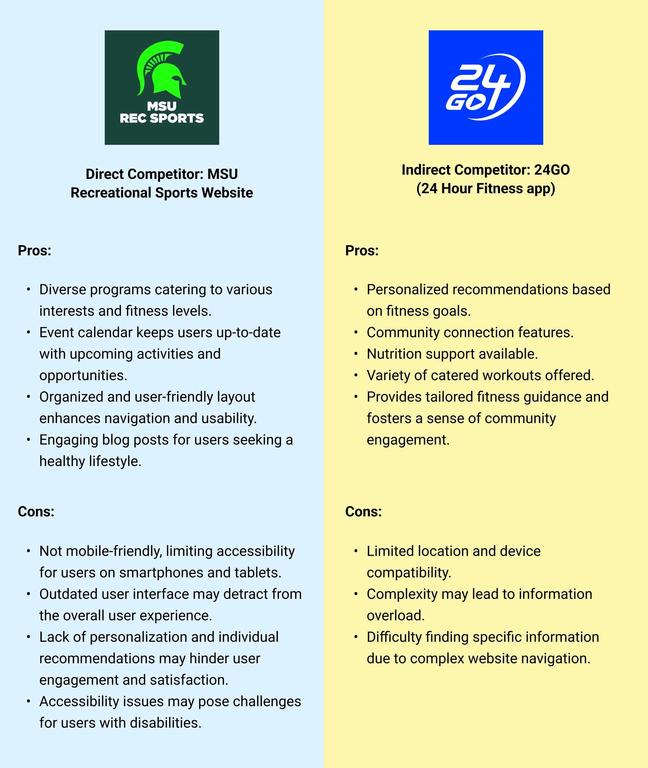
We also conducted a competitive analysis to evaluate the strengths and weaknesses of similar apps in the market and completed a heuristic analysis to further identify design opportunities.
Key Discoveries
02
03
05
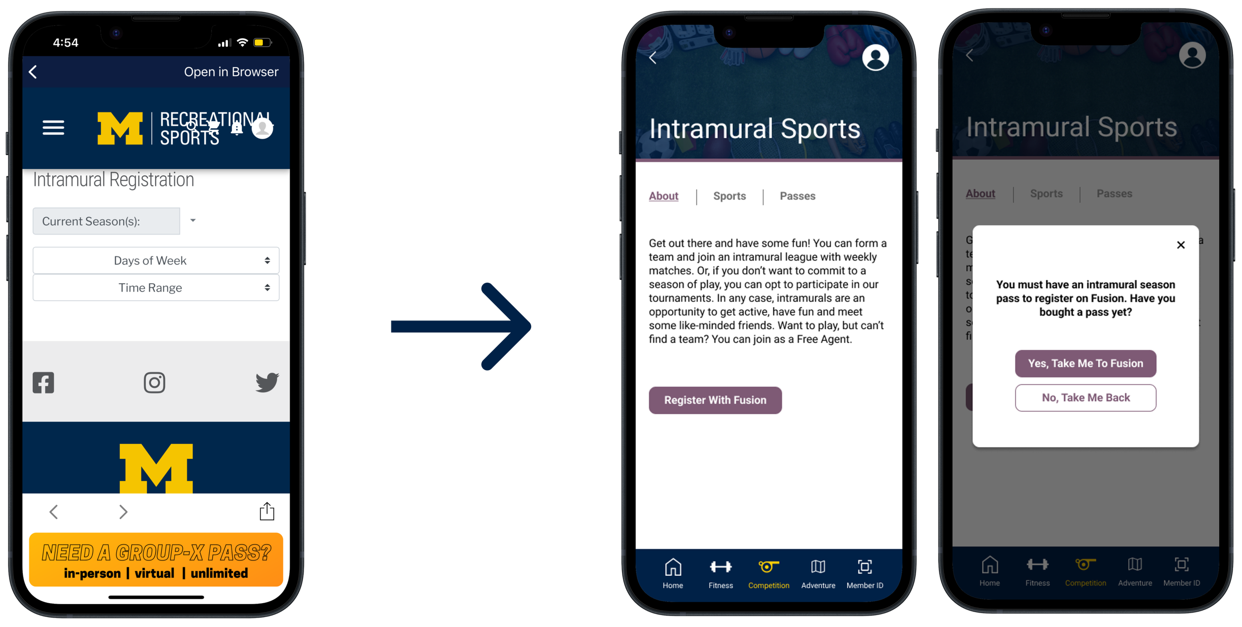
Intramural Sports
Competitive Analysis
Heuristic Analysis
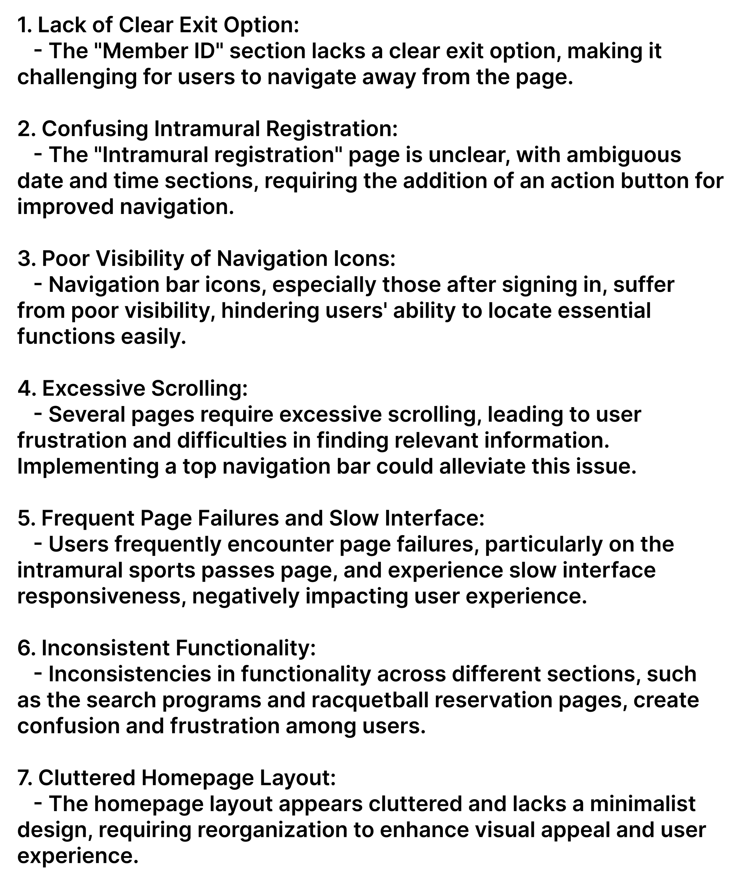
Biggest challenges encountered while using the app:
Group-X
Strategic use of color to highlight important elements, such as calls-to-action
Clear visual hierarchy directing attention to critical information

Created a functional page for users to register
Improved text for better understanding of IM pass purpose
PROTOTYPE
IN RETROSPECT
01
Good team communication is crucial for crafting a unified design system and ensuring brand alignment.
02
Design work is always changing, so adaptability becomes increasingly important.
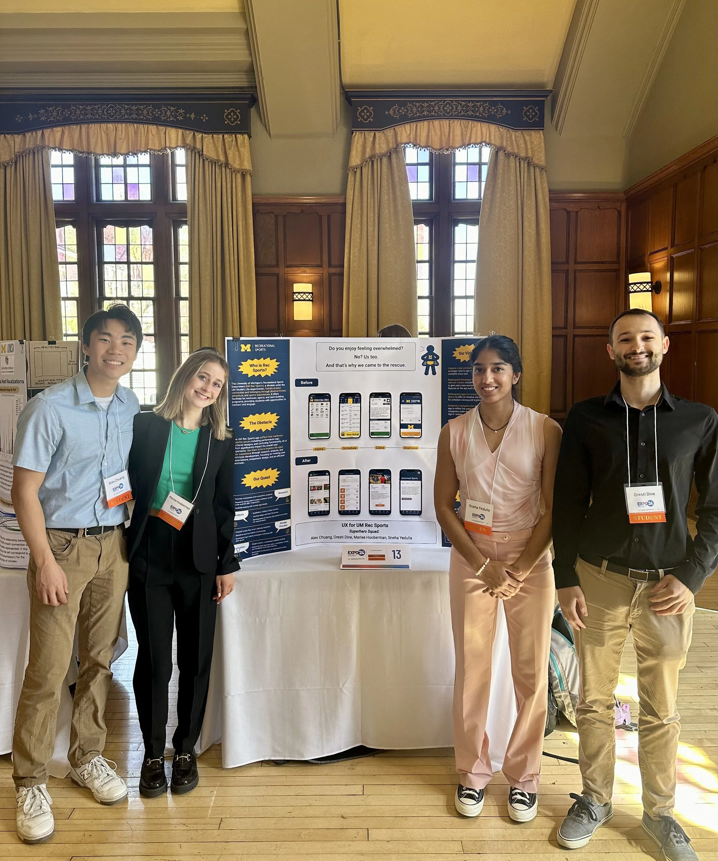
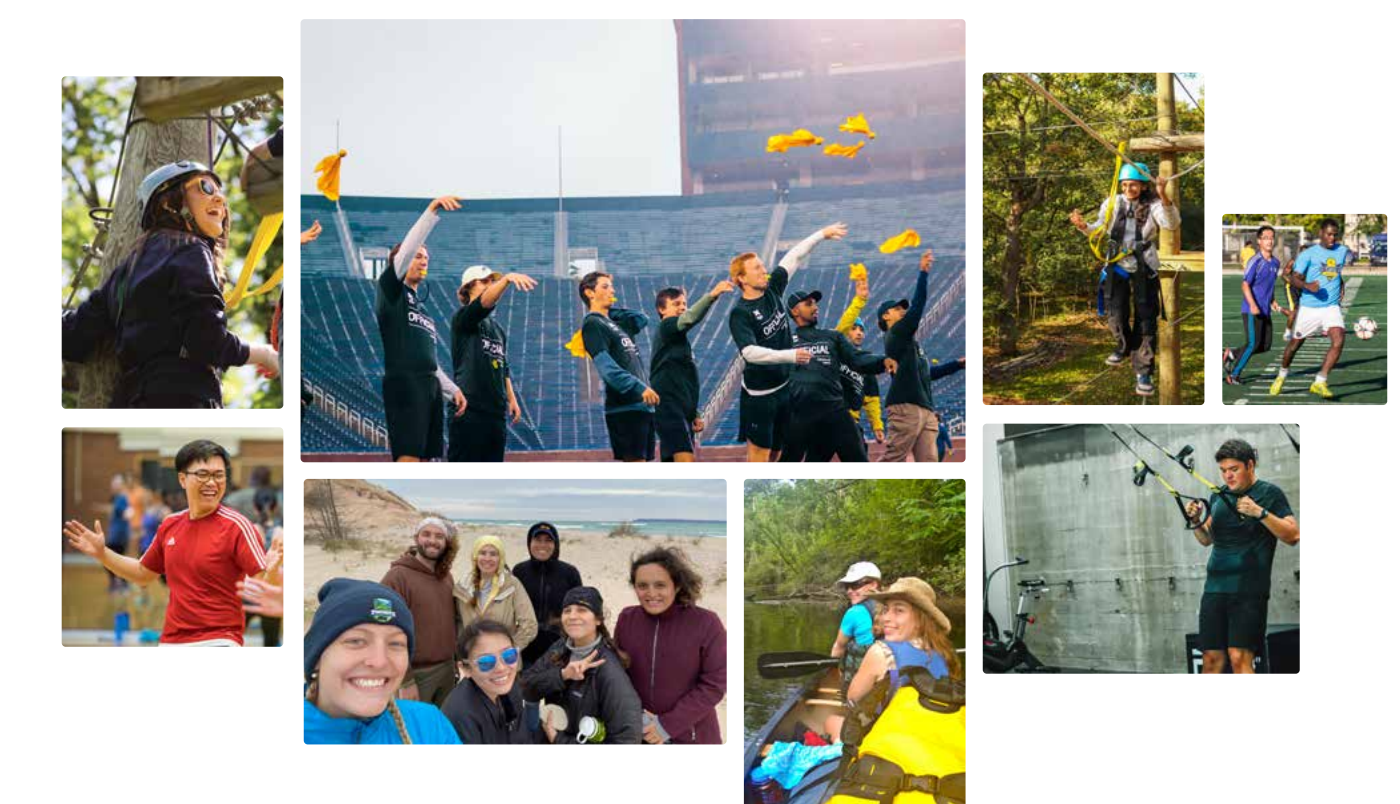
Our team presenting our work at the university’s design exposition!
Primary reasons users use the app:
01
04
Intramural Sports
THE INTRODUCTION
Recreational Sports at the University of Michigan (UM Rec Sports) is committed to fostering a vibrant community where students can engage in physical fitness, adventure, and sports experiences while feeling a sense of belonging. Despite the pivotal role of its physical facilities, UM Rec Sports recognizes the growing importance of its digital presence. UM Rec Sports believes that many students are unaware of their extensive programs and offerings due to the poor usability of their current app, which relies on Fusion, a third-party management software, posing significant limitations.
UM Rec Sports is determined to address these challenges by developing its own personalized app tailored specifically to the needs and preferences of the University of Michigan community. This new app will not only enhance the digital experience but also better reflect UM Rec Sports’ core values and offerings, empowering students to fully explore and participate in the wide range of programs and experiences available.
Essentially, UM Rec Sports wants to
revamp their mobile app to improve user experience, strengthen brand identity, and foster greater connectivity with the student community.
BACKGROUND
-
Sneha Yedulla, Alex Chuang, Marlee Hooberman, Oresti Dine
-
September 2023 - May 2024
-
Figma, Miro
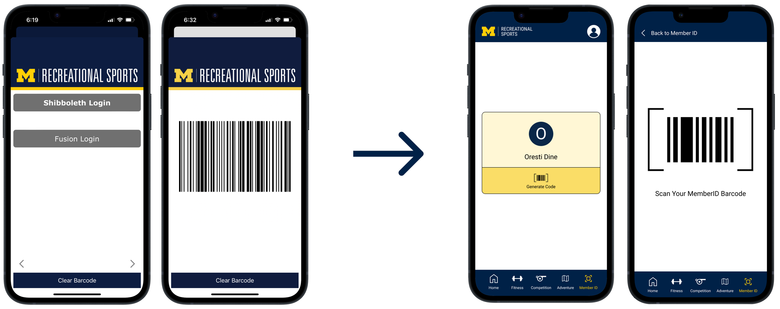
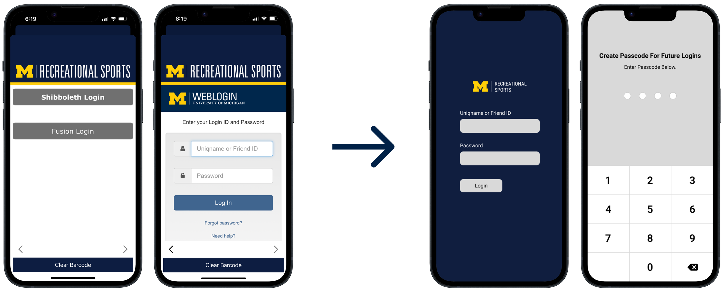
Member ID Sign-In
Group-X Classes
Checking Facility Hours
Court Reservations
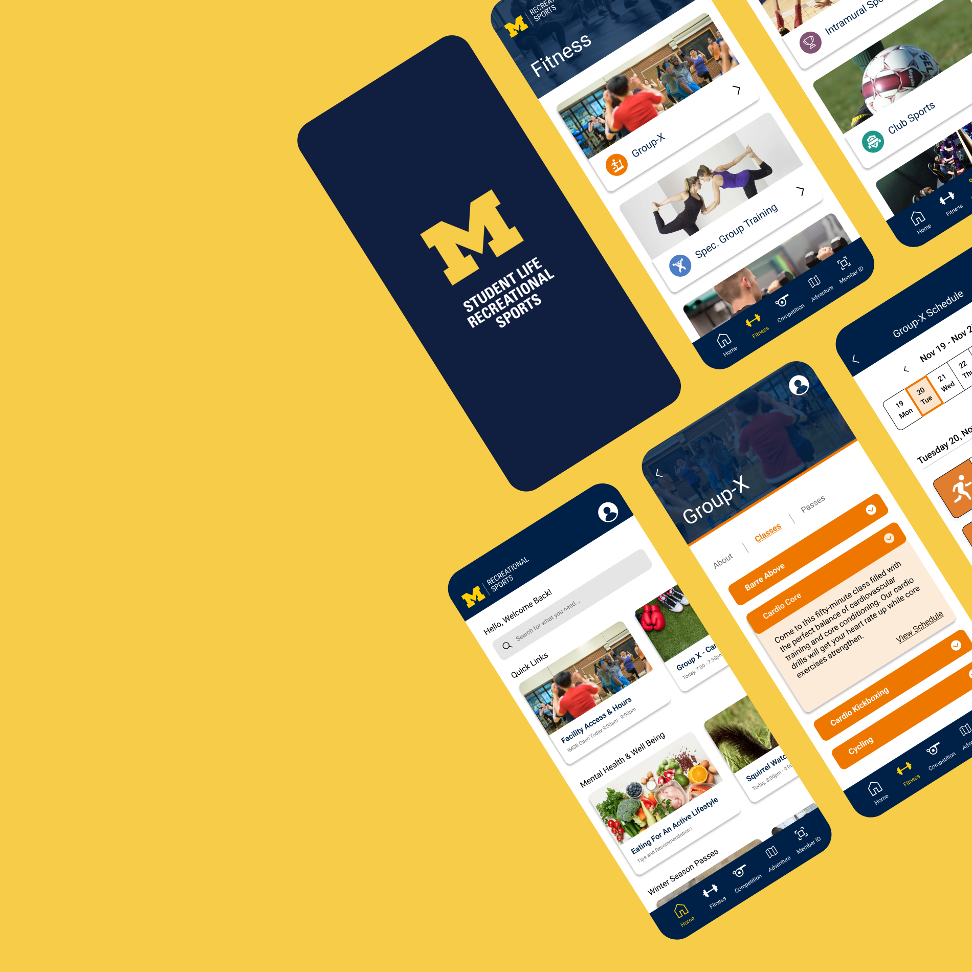
DESIGN PHASE
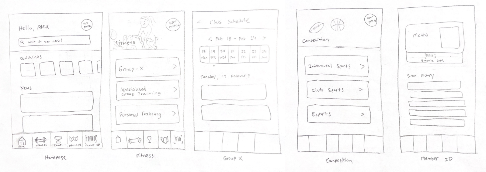
Mid-Fidelity
We proceeded to create mid-fidelity wireframes for the 5 main screens and for additional screens for interactions within each of the main screens. Below, you'll find the mid-fidelity wireframes for the 5 main screens.
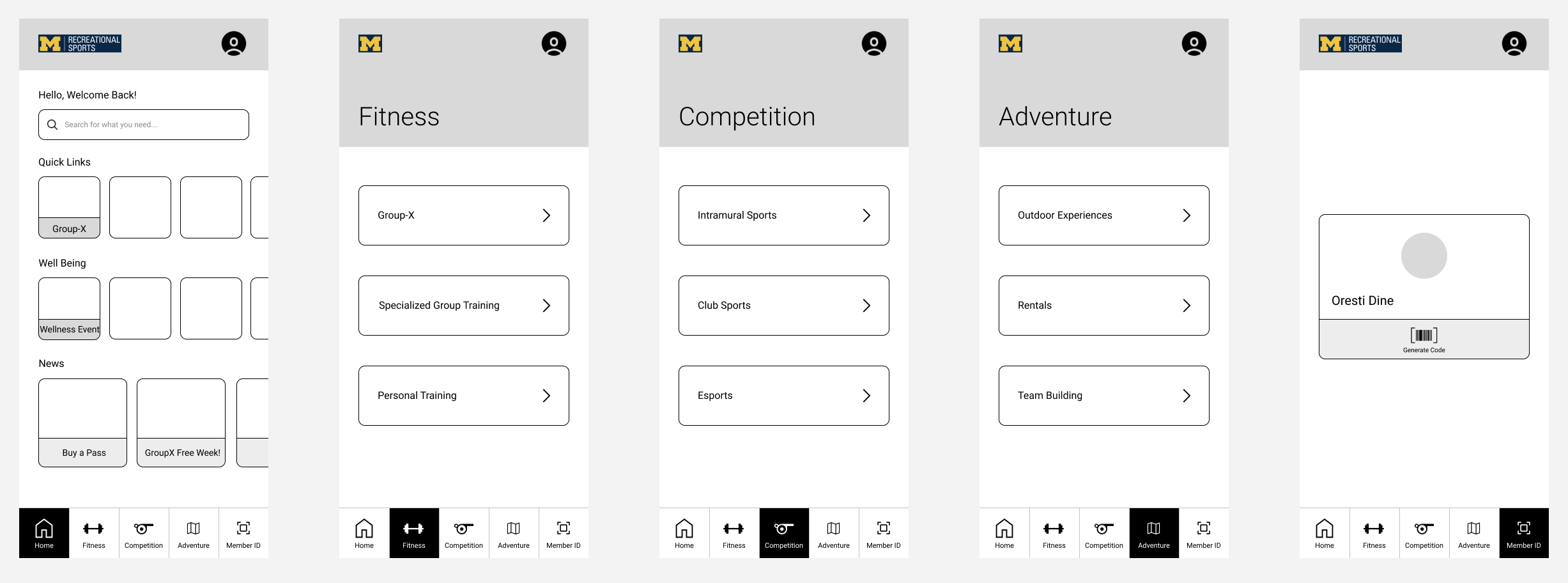
High-Fidelity
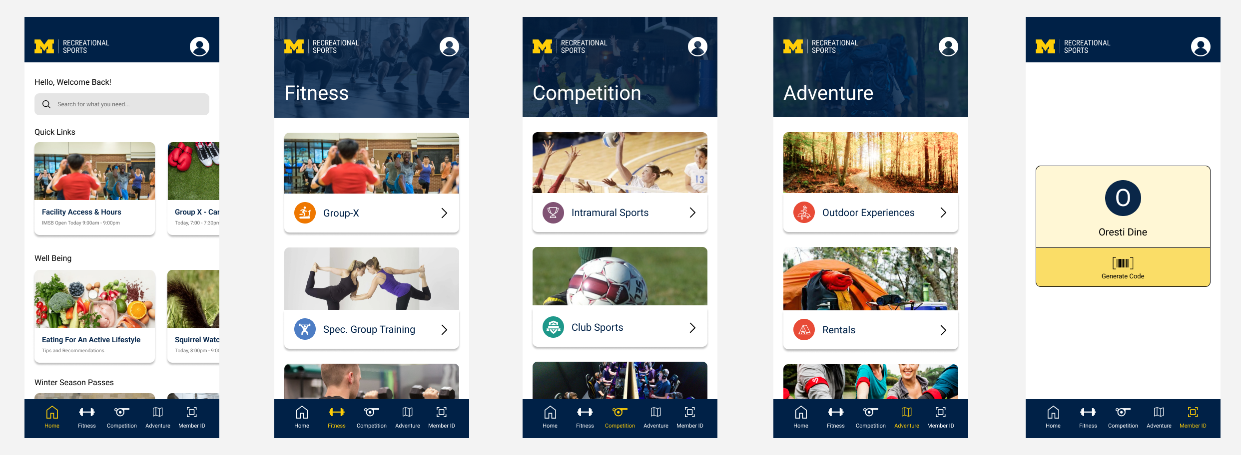
Home Page
Search bar and a quick links section for popular functions
Bottom navigation bar instead of icons across screen
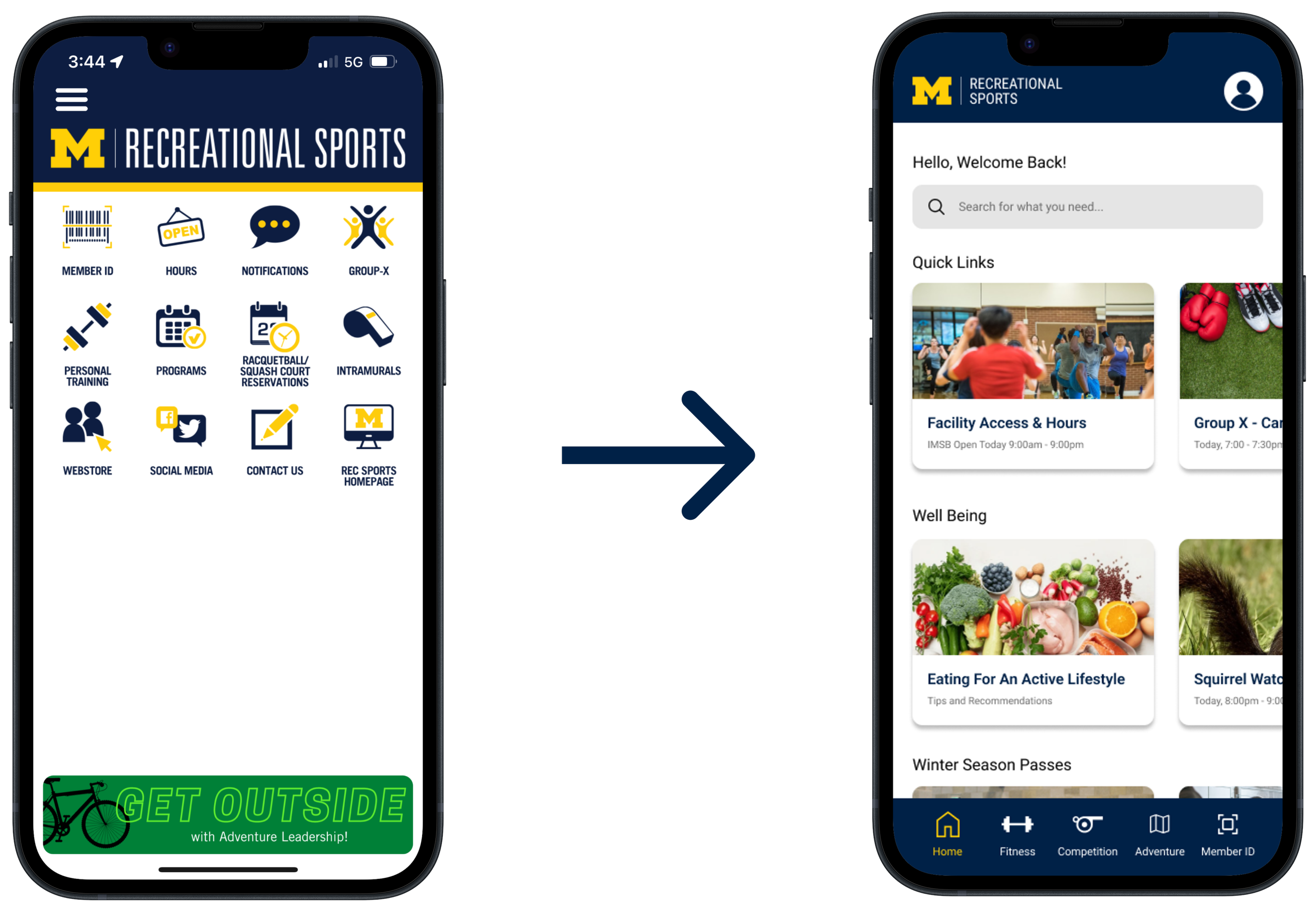
Convenient barcode access with one click for facility entry, eliminating the need for logging in repeatedly
Member ID Sign-In
We then transitioned to the high-fidelity stage, adhering closely to the Rec Sports style guide for color choices to maintain consistency and reinforce brand identity. Below are the high fidelity wireframes for the 5 main screens.
Overall, the process involved multiple iterations, with user testing conducted on versions throughout prototyping to ensure we were on the right track. Below are some usability test insights gathered when we tested our prototype with users.
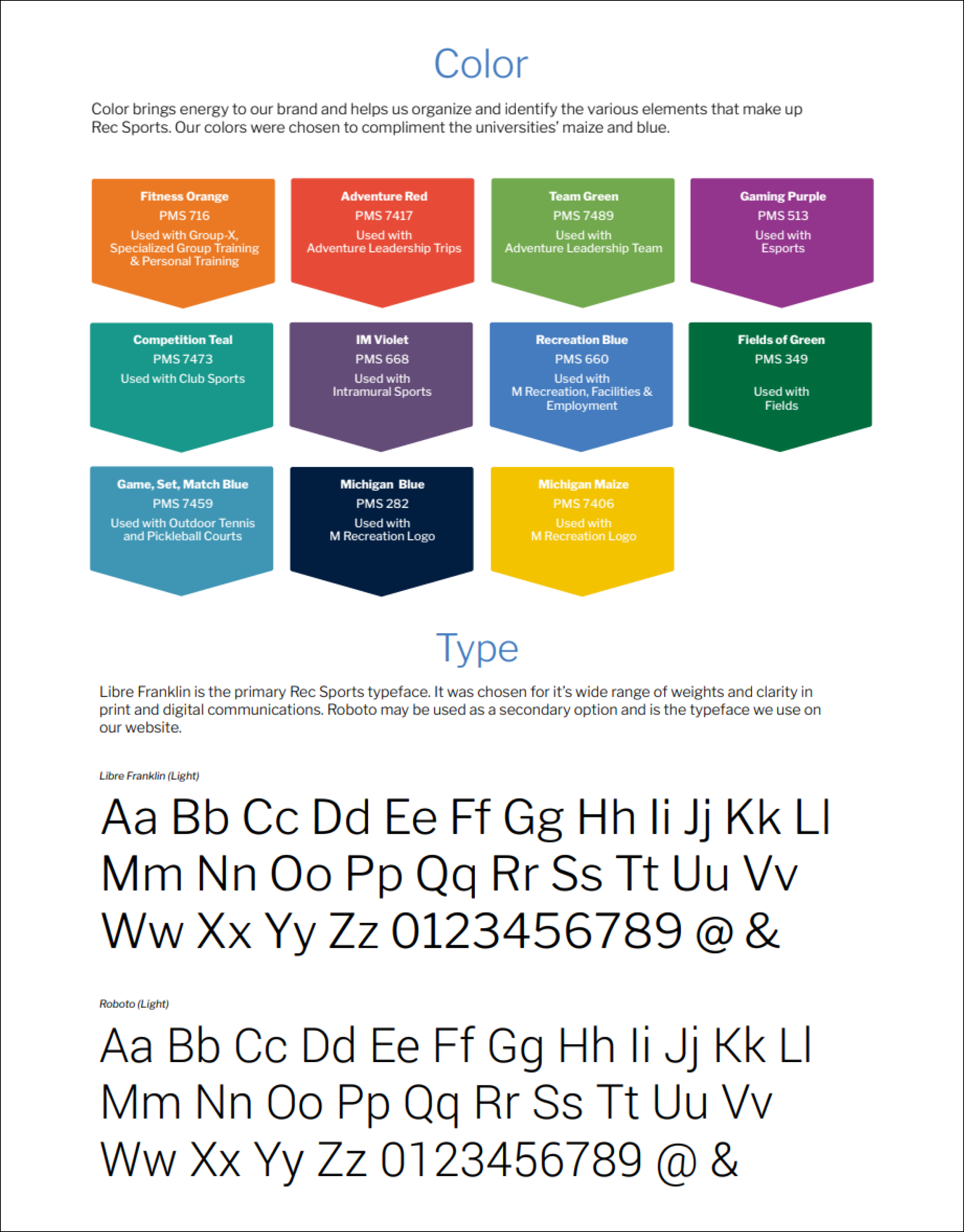
Additionally, it was essential for us to follow the UM Rec Sports style guide provided by the client. This ensured consistency between the existing website and the app and preserved UM Rec Sports’ brand identity.
Rationale
HERE’S THE
FINAL DESIGN
Registration
Passcode option for easier future logins by eliminating the need for repeated sign-ins
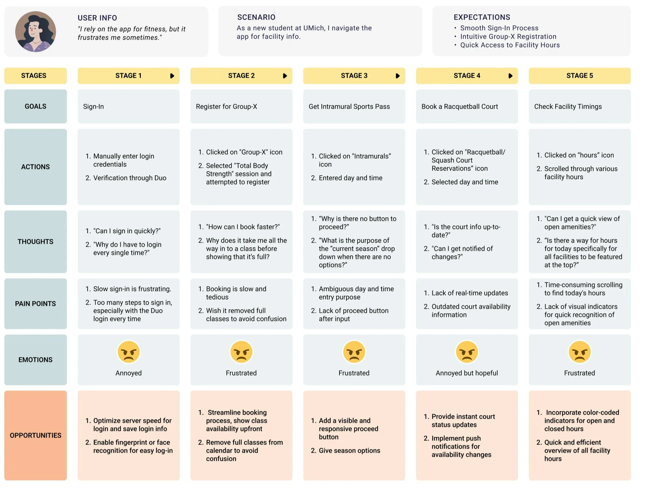
Journey Map
02
04
Layout lacks clarity and intuitiveness
Frequent page failures
01
03
05
Tedious sign-in and registration process
Slow loading times
Lack of filtering options
Users feel frustrated and overwhelmed when using the U-M Rec Sports app, hindering their ability to efficiently access key features and services and sometimes leading them to abandon the app altogether.
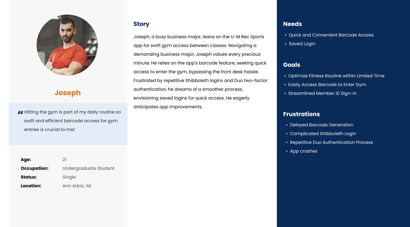
Empathizing
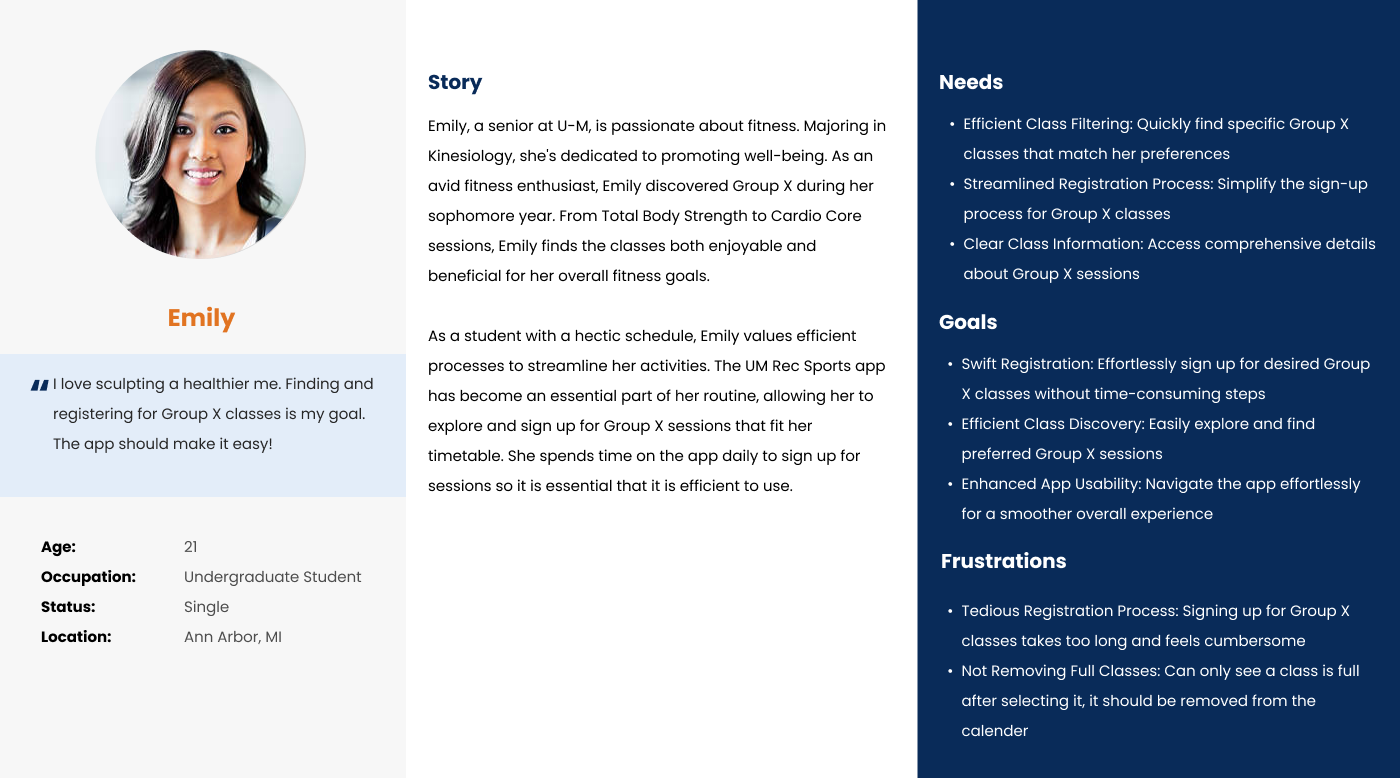
U-M Rec Sports users encounter various challenges, from checking into the gym to signing up for classes efficiently. To grasp their experiences comprehensively, user personas and a journey map were created, mapping out their interactions and emotions across key stages for design optimization. This approach aligns with U-M Rec Sports’ goal of ensuring a seamless user experience.
Personas
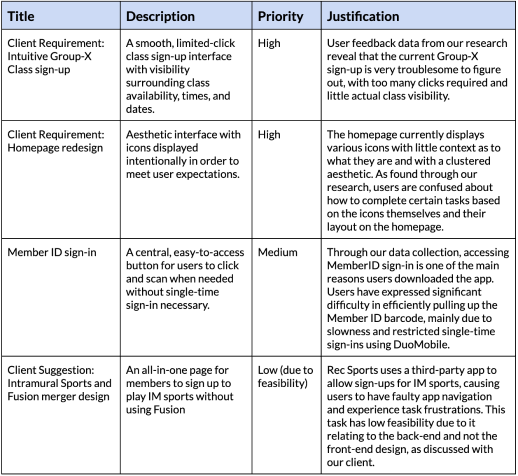
DESIGN REQUIREMENTS
From the journey mapping, key areas for design improvements and opportunities were identified. The ideation process began by generating all ideas through creative brainstorming to address users’ frustrations. Due to our strict timeline in working with our client, prioritization of key features was determined based on the primary purposes for using the app and the stages where users encounter the greatest pain points.
Low-Fidelity
We opted for five main pages in the app's navigation bar, sketching them initially to visualize design solutions.